|
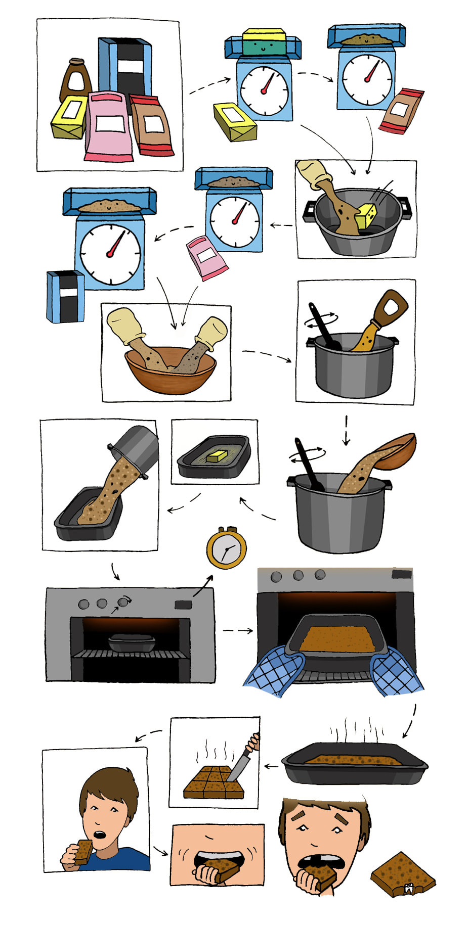
This is my final piece that I've illustrated for this recipe. Although I don't particularly like doing much digital work, I am happy with the result and I think combined with the traditional drawing aspect it has produced quite a solid outcome. I made a few last minute changes to some of the imagery and layout but in terms of the flow/colour scheme etc, it all fits well together. I would've liked to have put more of a personal spin on this project, but having chosen a rather boring recipe to begin with and a less than eventful baking process, I didn't really have much in mind in terms of adding characters or a story-line. 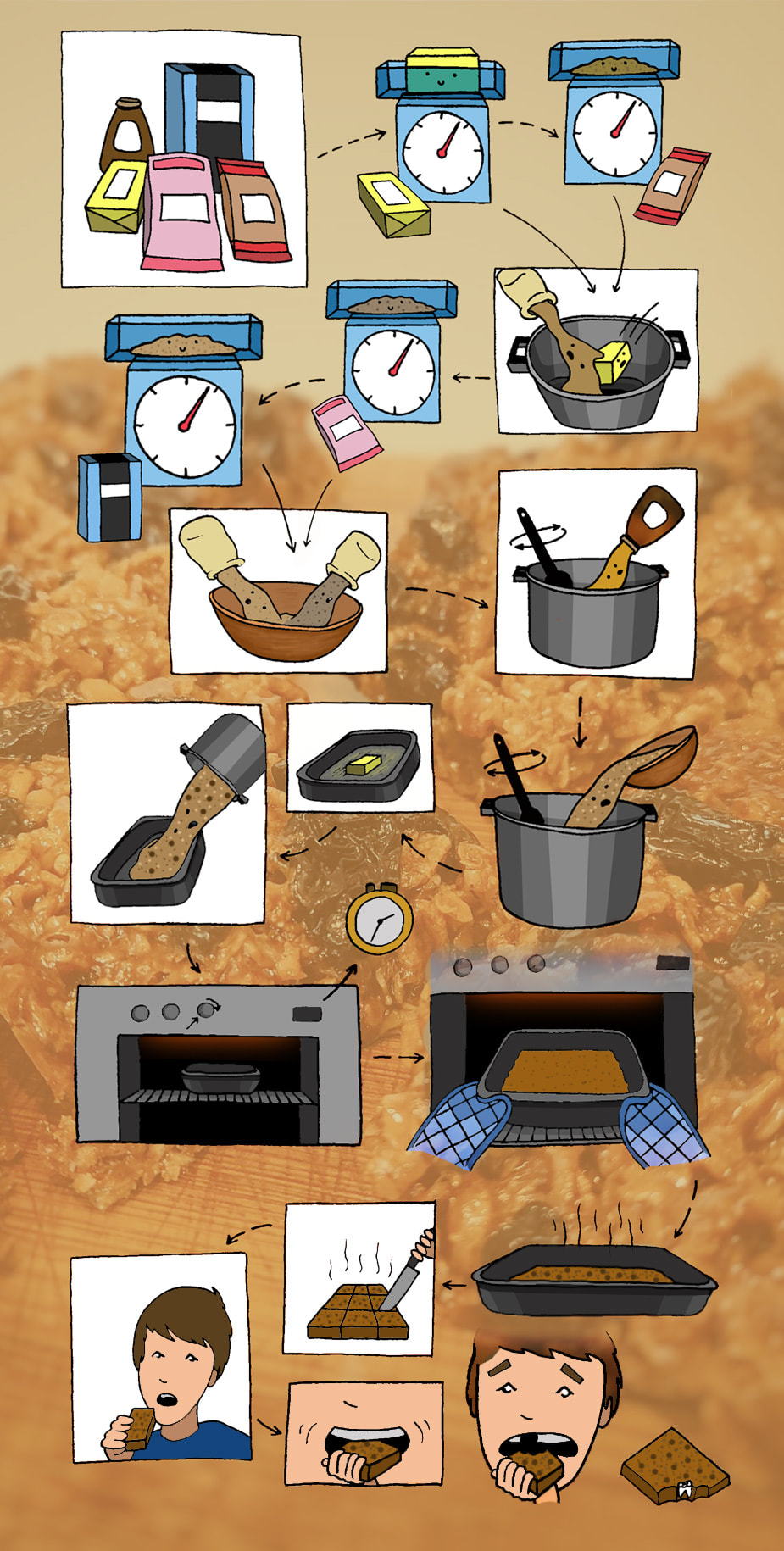
0 Comments
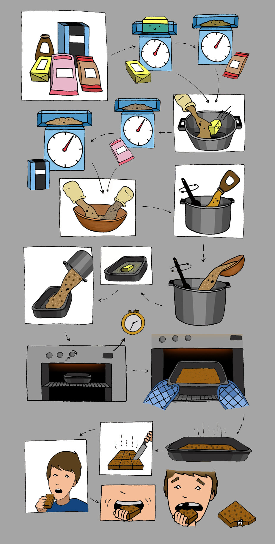
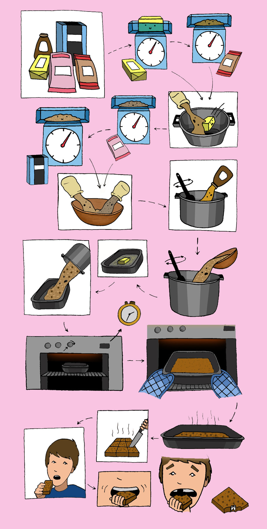
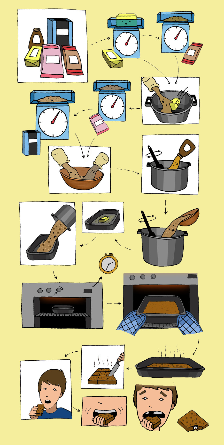
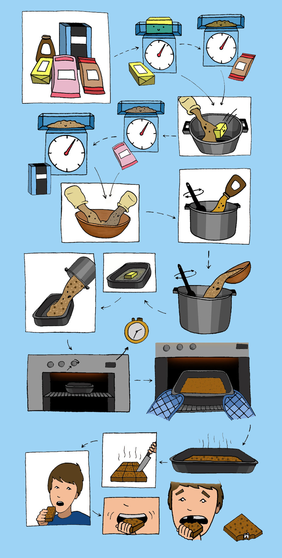
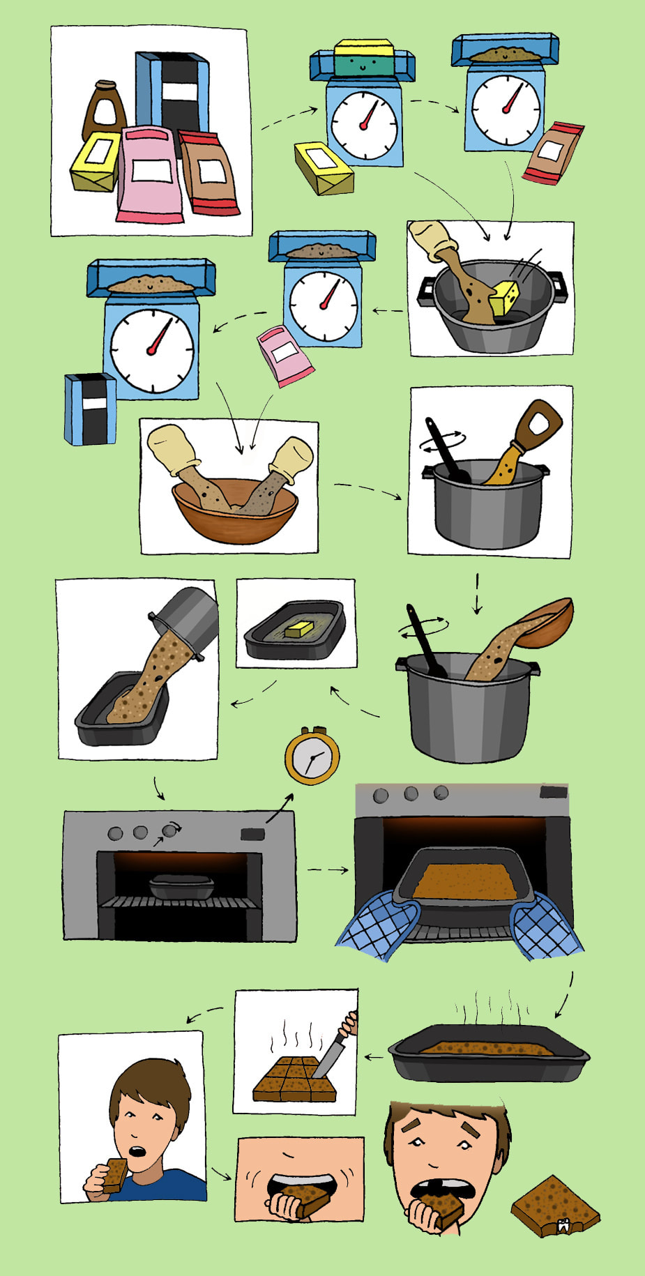
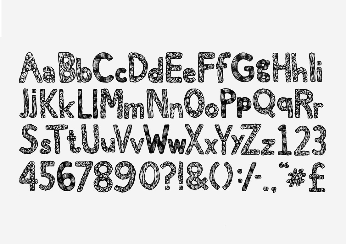
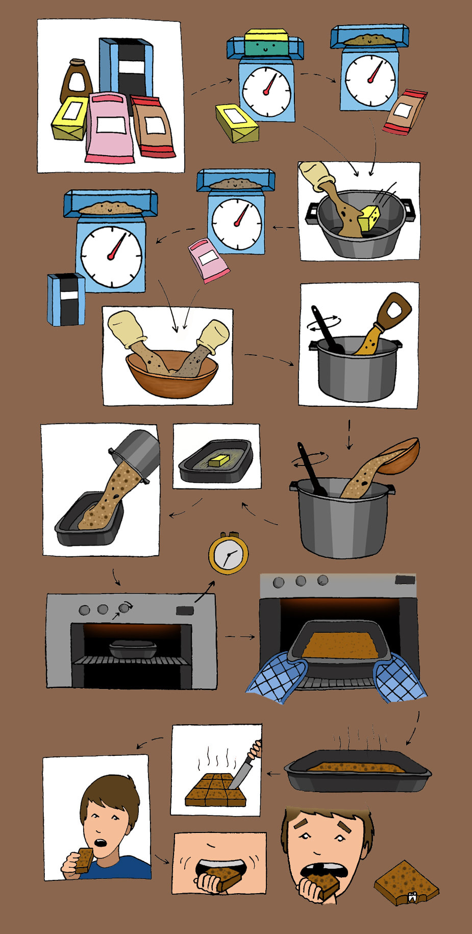
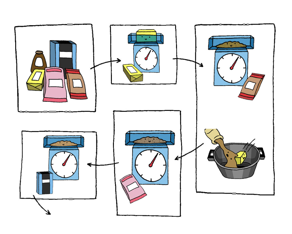
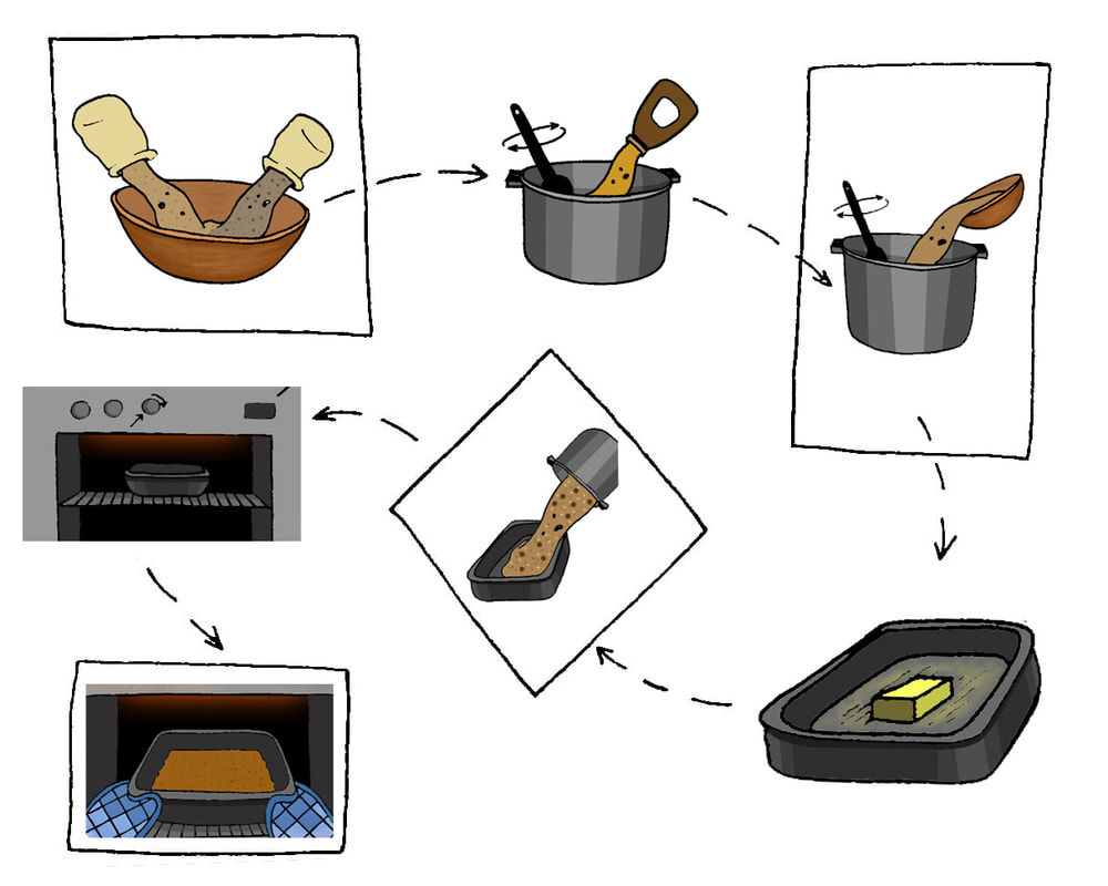
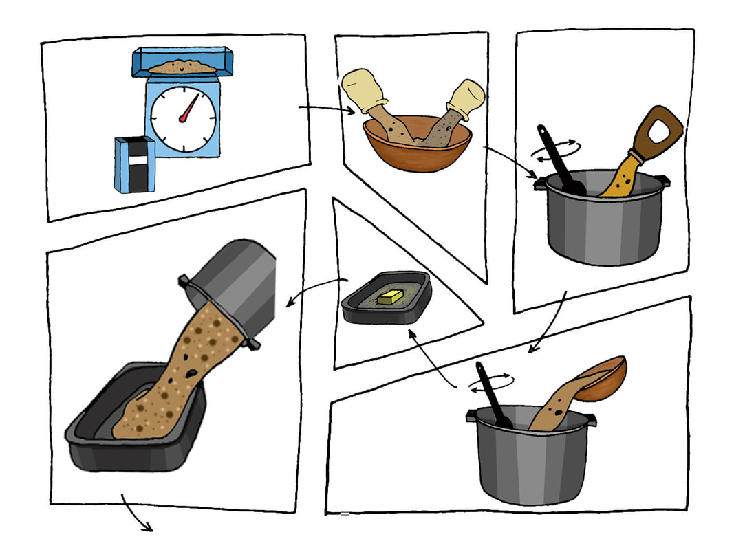
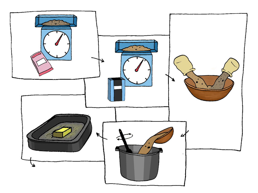
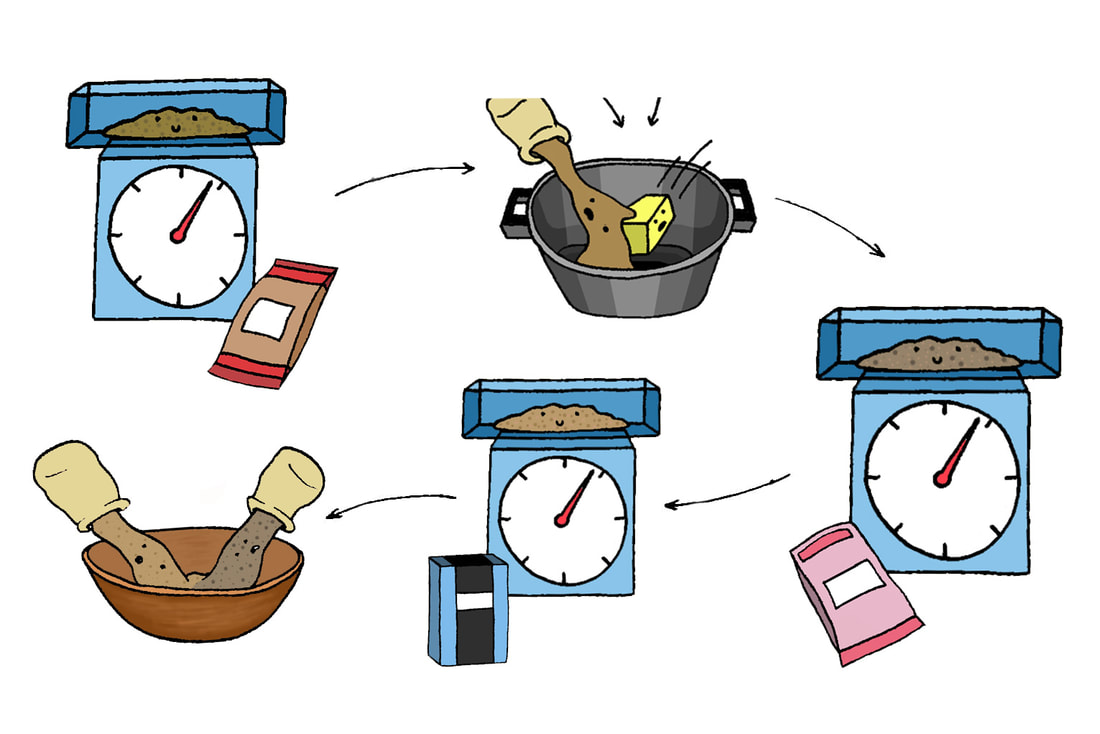
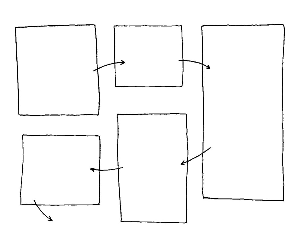
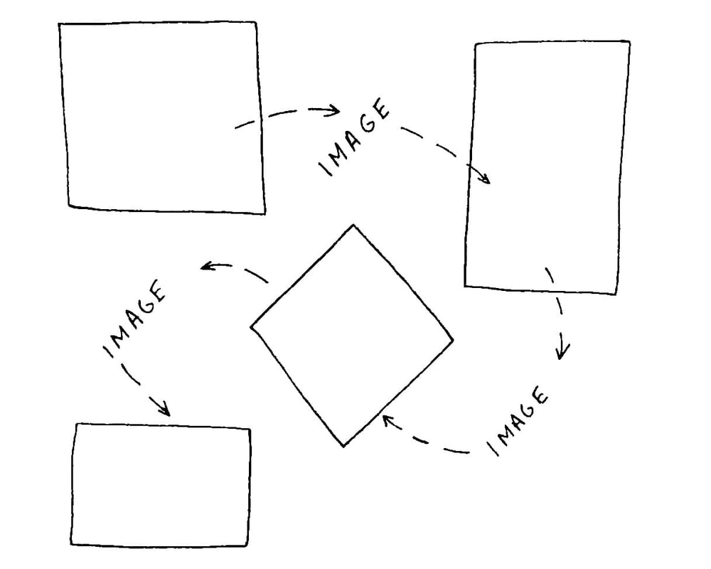
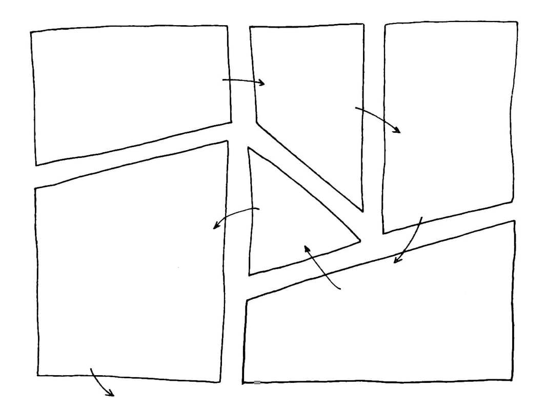
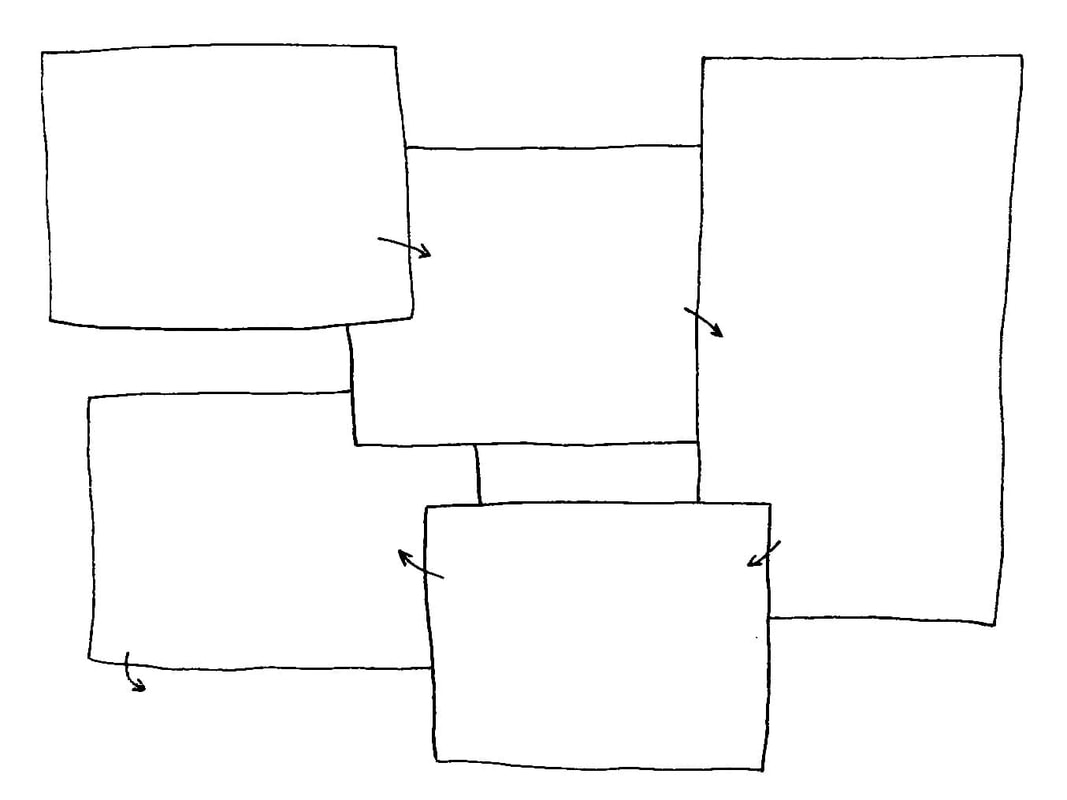
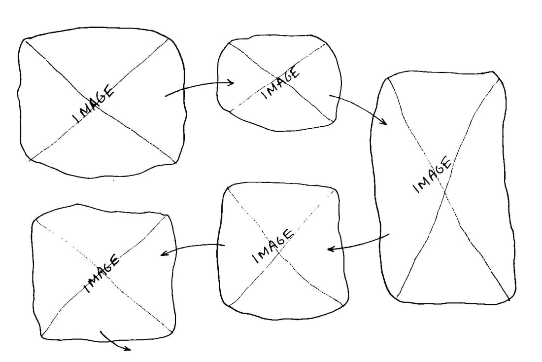
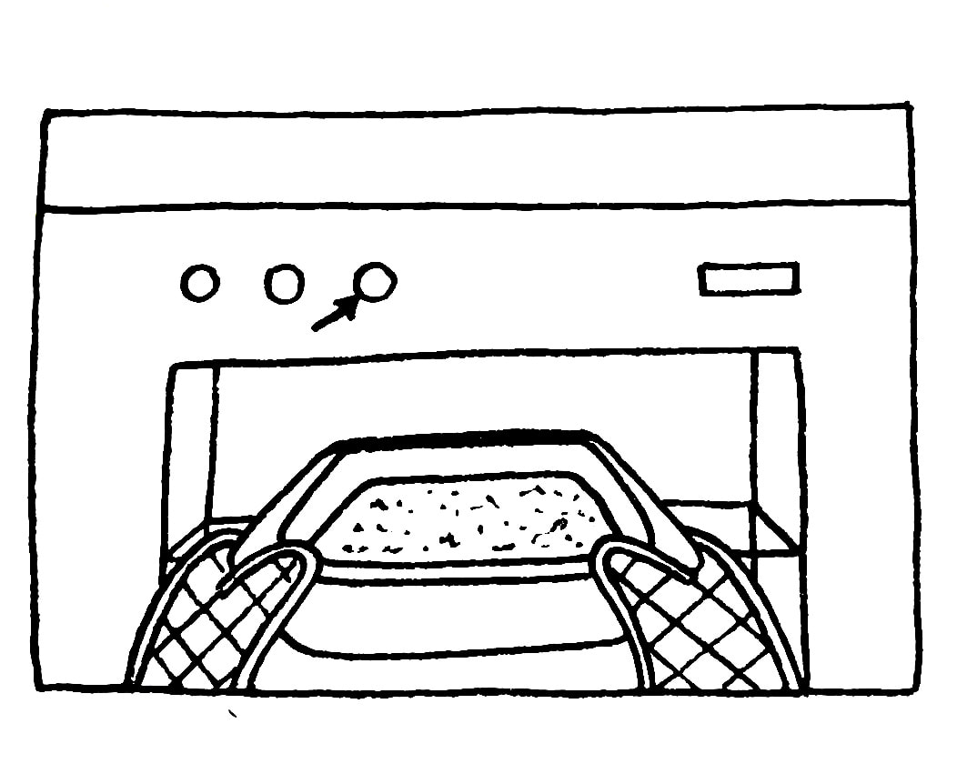
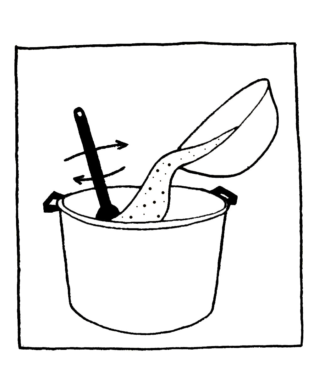
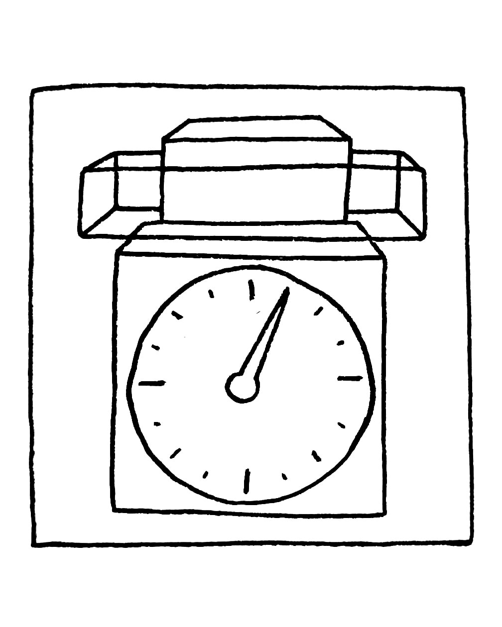
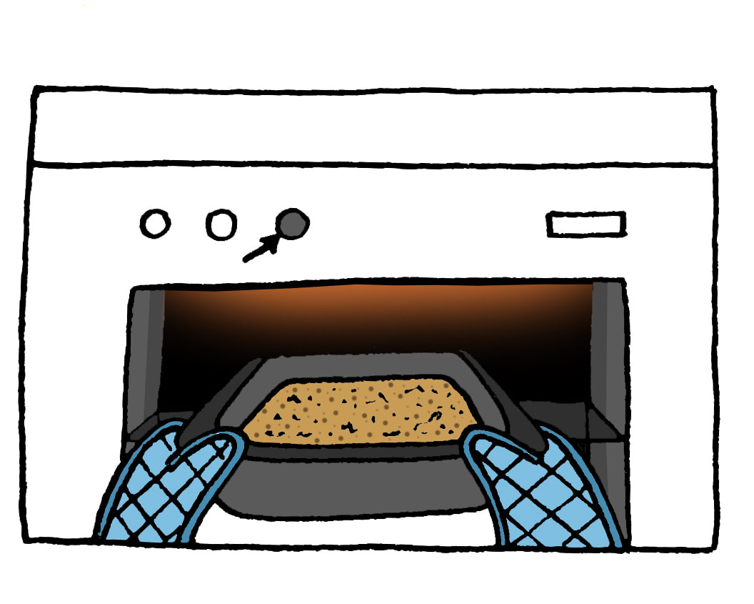
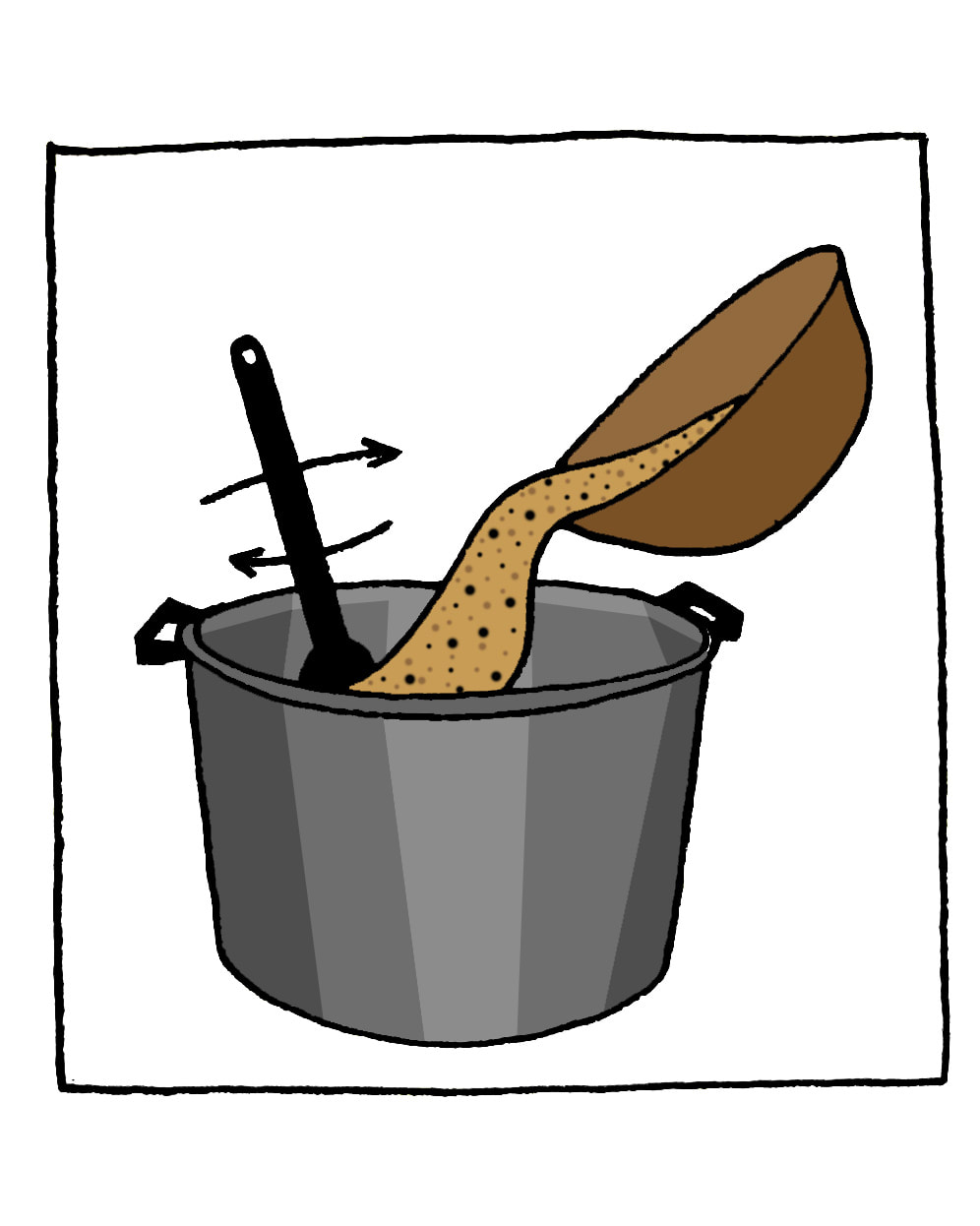
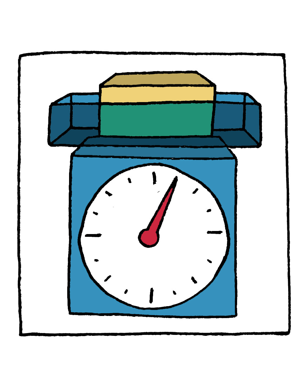
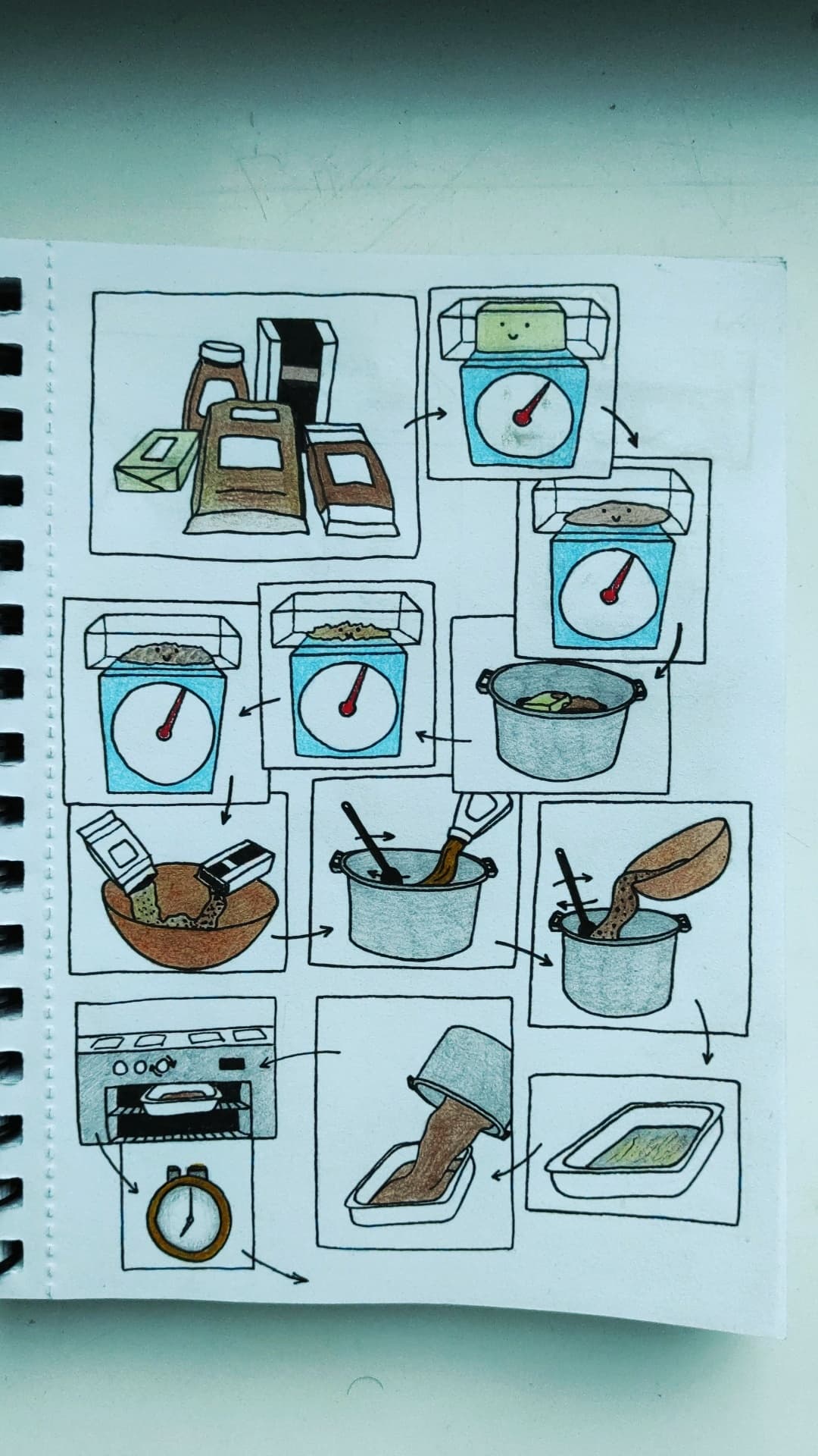
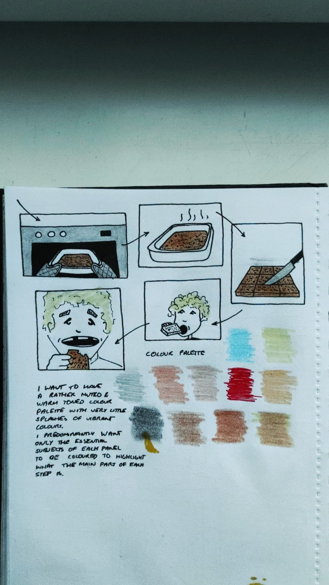
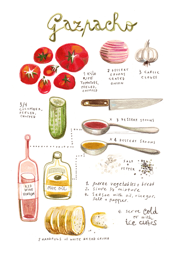
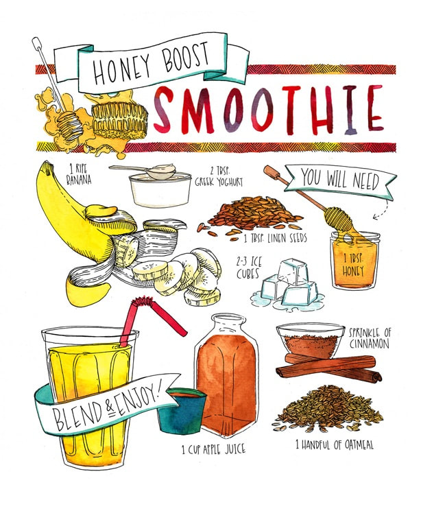
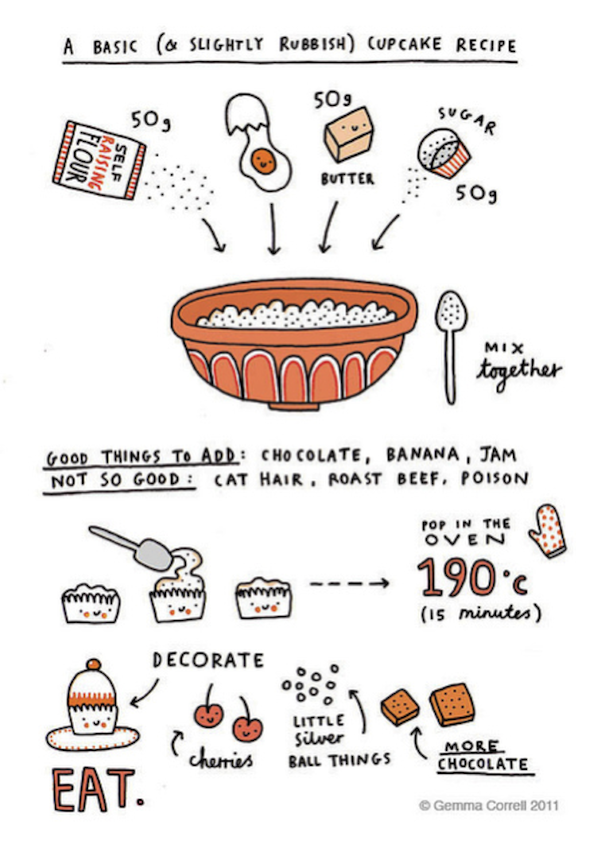
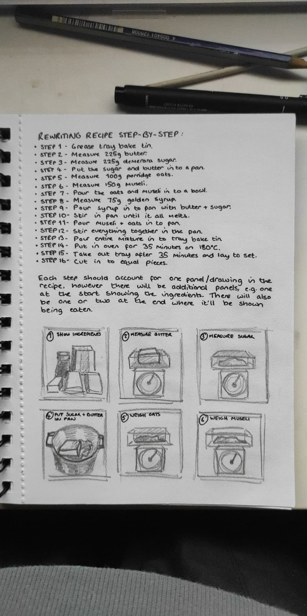
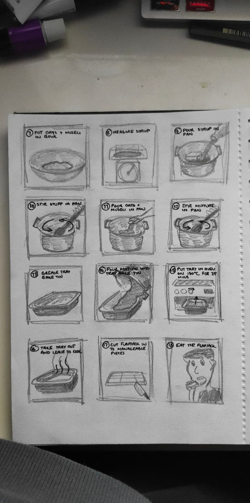
Here I've experimented with some different variations of backgrounds. Since I'd previously mentioned the use of muted/pastel colours in my illustrations, I thought why not add a splash to the background as well. First off, the blank white and grey just don't work as they clash too much with the images. The pastel colours look quite nice actually and add a touch more life into the whole thing, making it feel more appealing to a younger/child audience. The browns at the bottom don't work particularly well as solid block colours, especially the darker tone, however the lighter, more beige-type one in the bottom left has a much more well-suited tone and is fitting with the recipe. All of the above however, felt to have been lacking something, so in the final test I used an original photo of my flapjacks and overlayed it on to the beige-coloured background I mentioned before, but reduced the opacity to about 25% so that it wasn't so textured to distract from the images, but not too bland to lack liveliness. This, I think, will be my final decision on this outcome. Following on from the last post about different layout styles, I've actually tried testing them out here with some of my actual illustrations. Now seeing what they look like almost completed, I still retain my opinions from the previous post and find the most attractive one to be the second. Since the images have just been placed over the top of the existing boxes and spaces in these examples, they don't all fit particularly well in to their designated spaces, so I obviously need to tailor each panel to each illustration and it's size/shape when following through with my final outcome. Here, I've drawn out a selection of layouts which I could potentially use going forward, inspired mainly from comic books. The first one in the top left is rather basic and simple, typical of comic books and just a general flowing structure, probably a bit too standard for my liking in this project. The second one in the middle is probably my favourite of all, where there are boxed images and stand-alone images in-between to break up the otherwise blocky geometric structure, like the first one. The one in the top right is probably second on my list of favourites. I like that the different shapes and corners all neatly fit together, almost like slices of a cake or a puzzle, which could be interesting for this project, however I can't see it flowing very well in the form of a recipe as they all interlock quite tightly and the order of the process could get confusing. The bottom left is similar to the first one, but rather than separate panels, these are all overlayed on to eachother, which again, is probably a bit too close-knit for my liking as I prefer the separation some of the others have as it brings order to the recipe. The final one is simply just stand-alone images, no panels, no borders, just the raw illustrations. Although this one seems popular with other recipe illustrations, I want to have some sort of background, and so the images themselves might get too lost within that, plus I don't want any of them to clash among eachother especially if they're in close proximity. After mentioning about moving into colouring my illustrations digitally and now having a solid colour palette, I did some template drawings here which I photographed and altered to look as if they were digitally drawn. In Photoshop, after boosting the contrast up to solidify the black lines, I simply used the paint bucket tool to fill in those areas which needed to be coloured. The comparison between original and coloured version can be seen below. I was uncertain about how the outcome would turn out, however playing around with various paintbrushes and adding some shading here and there, I quite like the end result. In an ideal world, something like this would be drawn first in Illustrator and then either coloured there too or moved in to Photoshop, however since I don't possess Illustrator, this will have to do. And, in actuality I think this combination of traditional hand drawn and graphics works better as you can see the patchiness and rough penmanship in the outlines which gives it a more personal touch. Following on from the last post briefly summarising the colour palette I plan to use, I have created a more refined digital version here. Using the tools at https://mycolor.space/ I selected several colours as a starting point and then the website itself generated similar ones that fit with them. As you can see there's very little in terms of vibrancy; there's a few pastel colours, but mostly warmer tones which are more appropriate for my particular recipe in my opinion. The tones of the ingredients are sort of beige and yellows and orange and browns, and particular in the images I took during the process, that was an evident theme throughout, hence this conclusion. In this series of illustrations I have begun to refine my style and think about a suitable colour palette. The colour palette I have chosen to opt for consists of rather muted, warm tones primarily, with an odd hint of more vibrant colours to brighten up the otherwise fairly bland nature of the whole illustration. The one thing I want to highlight in each panel/illustration is only the essential part of the steps, which I plan on doing by leaving the non-essential parts of the imagery colourless to emphasize the task at hand. Having now drawn this a few times and seeing how tacky it looks with traditional media like pens, pencils etc, I'm thinking about colourizing the entire thing digitally, which wasn't my original plan, however the outcome should be much more refined and professional and with a more solid colour palette, will hopefully be more appealing, especially to my desired audience of younger people. After looking at the different styles of illustration others have used in similar situations, I have come to the conclusion that I want to take a much more home-made approach, primarily appearing to children, possibly with elements of humour. I'm not looking for a detailed, accurate representation of the recipe, but rather a silly, child-friendly style, maybe with smiley faces on the ingredients or something and a bit of a story-line to go along with it. It was mentioned that the recipe does not have to reflect on a perfect outcome, but rather my own experience and I have chosen to take a humourous approach to this by having my recipe reflect on the awful quality and unpleasantness of my flapjacks. Maybe I can have someone's teeth falling out while biting in to it, or building a house with them to illustrate how they were almost like bricks. It just makes this a much more quirky and personal adaptation of a traditional, boring recipe. The secondary source images below are some of what inspired my desired style. Here I have re-written my own version of the original recipe to help me further plan my illustrations using a step-by-step format. I'm not entirely sure if I'm going to stick to the square format panels and have a total of 18 (as seen here), however it is a starting point for the imagery which each step may contain. One thing I do not like is the repeating imagery, particularly with the weighing scales and the pan, tray etc. There's no need to have the same illustration so many times, so I'll have to find a way around that, maybe by blending 2 frames in to one or include different angles etc. After completing the baking exercise, I began looking at other people's illustrative recipes and here I compiled a few mood boards with a collection of different styles and layouts just as a starting point for my own idea development. |